SHE Inc.,
Ad Banner Design
Overview
As an alumna of SHE likes, an online creative school for women, I was thrilled to support their growth by designing paid social media ad banners. These banners served as the primary touchpoint for acquiring new users and driving registrations for free trial lessons.
Over the course of the project, I delivered more than 100 static and video assets in 6months. By participating in weekly marketing meetings to analyze performance metrics, I established a rapid PDCA cycle—applying data-driven insights from each week's results to improve the effectiveness of the next batch of designs.
Client
SHE Inc.,
My role
Web/Marketing designer
Completed
2025.3
Team
Spported by senior communication designers in collaboration with marketing team

Production Process
Process
I designed each banner based on wireframes and marketing objectives provided by the marketing team. For every submission, I collaborated closely with other designers and marketers to refine the creative. On average, designs were finalized within 2 to 3 revisions after incorporating their feedback, completing the entire process from receiving the initial wireframe to final delivery within 3 business days.
My Role as a Designer
My Role
Since these ad banners were the primary driver for new user acquisition, my mission was to consistently deliver high-performing creatives. To achieve this, I focused on two key principles:
01 Strategic Information Architecture
I meticulously structured each banner to create a compelling story—from grabbing the user’s attention to building interest and ultimately driving the CTA click.
02 Proactive Problem Solving
When receiving feedback, I made it a priority to verbalize and clarify the underlying intent of each instruction. This allowed me to propose multiple creative solutions beyond just following directions, always striving to maximize the banner's effectiveness.
Work 1 : Using Color to Amplify the Message
Work 1
Information Architecture
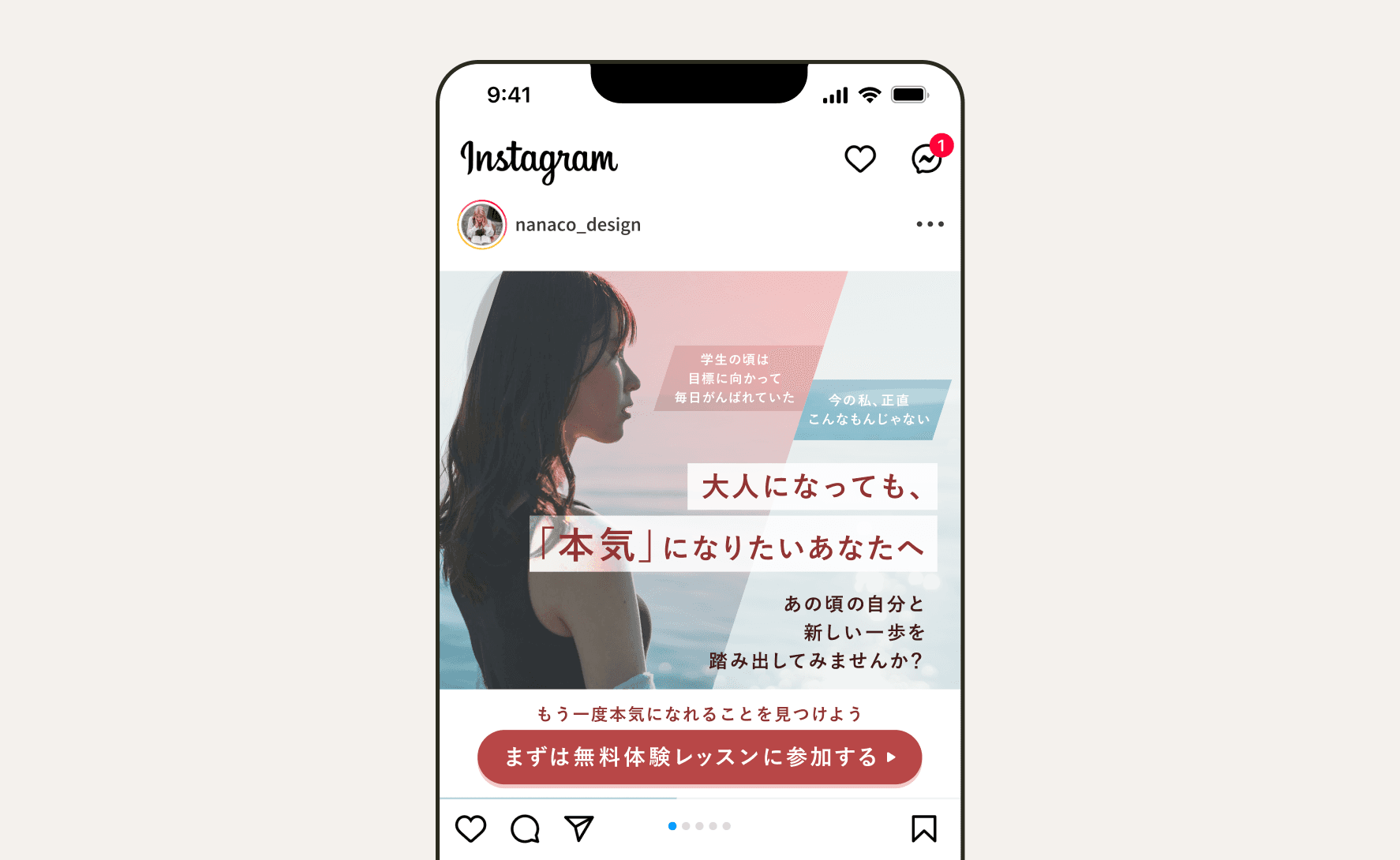
I designed a "story-driven" layout: First, a hook about "unsettled feelings" to grab attention, followed by a main copy emphasizing that "it's never too late to challenge yourself." Finally, a CTA to encourage action.
Photo Selection
I chose a photo of a woman in the target age group with a serious, determined expression. This aligns with the passionate theme of "taking it seriously" and helps users project themselves onto the visual.
Color Scheme
Deep red is the primary color to represent "passion." I used warm colors for positive copy and cool colors for negative hooks to create a visual contrast that enhances the impact of the text.

Work 2 : Copy-First Design Focused on "Continuity”
Work 2
Information Architecture
Based on the marketer's request to make the copy stand out most, I placed the main message front and center. The flow starts with a hook addressing the "Can I really do this?" anxiety, followed by the solution, three concrete reasons for success, and a final CTA.
Layout & Visibility
By isolating the main copy in the center, I ensured it is the first thing users see. This clear hierarchy guides the user through the logical "problem-solution-proof" sequence.
Color Scheme
I adopted a vibrant pink and yellow palette specifically to make the main copy pop and ensure maximum visibility against any background.


Work 3 : Optimized Layout Based on Wireframes
Work 3
Information Architecture
The original wireframe had a 4-step vertical layout. I proposed a more compact 3-step layout by placing the two success stories side-by-side. This creates a better contrast with the main copy and allows users to process the information intuitively with fewer eye movements.
Color Scheme
I used a consistent white and pink scheme to differentiate the core message from other sections. For the CTA (Call to Action), I applied warm colors to grab attention and improve click-through performance.
Typography
Since "salary increase" is the primary hook, I significantly increased the font size for the numerical data to ensure the key benefits stand out immediately.


Outcomes
Outcomes
Achieved a CVR of 3.27%, contributing to trial lesson recruitment
Surpassing the target CVR for ad banners, this campaign helped increase trial lesson participation, directly impacting enrollment conversions and company revenue.
Serving as the first touchpoint for future students
As an online career school for women, SHElikes often attracts students aiming to become web designers. Ad banners act as the first interaction with potential students, and by creating visually appealing designs true to SHE’s brand, I helped foster impressions such as “A trustworthy women-focused school” and “I want to learn at SHE so I can create such beautiful designs.” This played a key role in the communication design that draws in future students emotionally.

