Mamoruba Logo & Brand Design
Logo & print design
Overview
OTERA Co., Ltd. needed to establish a logo and brand identity for Mamoruba, their community support service, and apply that identity consistently across all service-related creative materials, including flyers and the app. As the graphic designer, I developed the logo and visual direction to translate the client's vision and the service's mission into something visual and tangible.
Client
Otera inc.,
My role
Graphic designer
Completed
2025.12
Learn the philosophy of Mamoruba
Purpose
About Mamoruba
Mamoruba is a matching service that connects elderly residents and others who need daily support with paid volunteers who provide that support. Its goal is to strengthen genuine, local connections within the community and expand a culture of mutual care.
What the logo needed to achieve
The logo needed to build trust in the service as it grows, while also visually communicating warmth, connection, and support.
Interpret the philosophy into visuals
Process
Keywords
・Sense of safety and trust
・Intergenerational connection within the community
・A clean, credible service backed by local government
・Warmth that comes from human connection

Design process
I started with a broad brainstorming session and narrowed it down to four directions that best captured the themes of human connection and support while meeting the client's preference for something modern and simple.
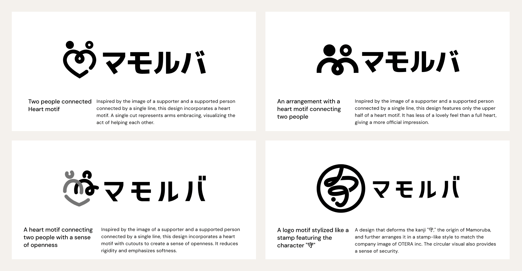
From there, I refined the most well-received concept, refining the typography and details to reach the final logo. The mark is an abstract heart shape depicting two people reaching toward each other. It's a warm, meaningful symbol that reflects the core belief behind the service. The final logo was delivered alongside usage guidelines.

Extending the Brand
Extend
The brand was applied consistently across multiple touch-points, including the Mamoruba job-matching app for supporters, service flyers, and event panels.

Outcomes
Outcomes
Unifying the Brand Experience Across All Touchpoints
Before this project, the service had no established logo or brand guidelines, leaving each creative output visually inconsistent. By building a complete brand system from the ground up, I unified the brand experience across every touchpoint, from the app UI to printed materials.
Building Trust and Driving User Acquisition
Established a visual identity that balances approachability and trustworthiness, directly supporting user acquisition on both sides of the platform: those seeking support and those providing it.

