Mamoruba App
Product Design
Overview
OTERA Co., Ltd. aimed to operate more smoothly its community support service "Mamoruba," which connects local residents' "small everyday troubles" — such as cleaning and shopping — with "people who want to help," in the form of paid volunteering.
To replace the time consuming process of manually making matches, we set out to develop a dedicated job-matching application.
As a UX/UI Designer, I deconstructed the manual workflow and translated it into functional app requirements. My role spanned from user analysis to final UI design.
AI tools were actively used throughout the product design process, enabling a speedy two-month release.
Client
Otera inc.,
My role
Product designer
Completed
2026.2
Team
In collaboration with two developers
Identifying the current pain points
Purpose
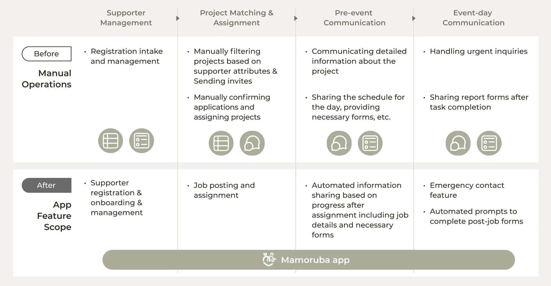
The client was managing supporter registrations through spreadsheets, manually reviewing registration details, notifying supporters of jobs through a separate chat app, and sending assignment details via manual messages. This process was consuming a significant amount of time.
The primary goal of the app was to automate the matching process and post-assignment communication that the team had been handling manually, reduce operational workload, and enable smoother service delivery.
Through the app design, we aimed to create an environment where both supporters and staff could manage assignments smoothly, with all necessary information accessible within the app from registration through activity completion. To achieve this, we first mapped out the current service workflow to identify which operations to incorporate into the app.
Building the Concept
Concept
"Effortless Community Contribution. No thinking required."
Given the nature of job matching, users need to simultaneously track multiple jobs, each at a different stage: applied and pending, assigned, or completed. The app needed to help users navigate these states clearly at all times.
The primary user segment is people in their 40s to 60s who want to contribute to their local community while earning a small income. The design needed to feel intuitive enough that users could move from application to activity completion without overthinking any step.
This concept guided us to build an app where users always know the status of each job and what to do next, with the right information delivered at the right moment without them having to figure it out themselves.
Understanding Users
User analysis and persona
Since the primary users were existing supporters already using the service, I analyzed attribute data from 70 registered supporters to understand their segments. By analyzing factors such as gender, age, availability, and personality traits, I identified key motivations and pain points. This data-driven approach allowed me to develop two distinct personas that guided the entire design strategy.


Turning Ideas Into Functional Prototype
User Flow & Wireframing
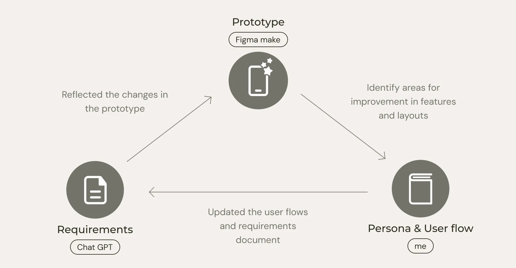
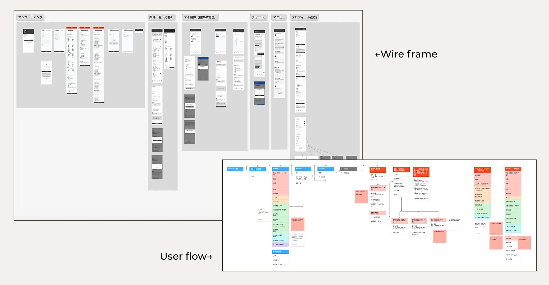
Based on the user analysis, personas, and app objectives, I translated the required features into a comprehensive requirements document using Chat GPT and developed the user flows. Using Figma Make, I created an initial prototype to bring these concepts to life.
By interacting with the prototype and comparing it against the personas and user flows, we identified areas for improvement in features and layouts.
We then updated the user flows and requirements document, reflected the changes in the prototype, and repeated this cycle.
As a result, wireframes were completed with a refined user experience.
Prototype feedback sessions were also conducted with stakeholders, enabling smooth feature validation and decision alignment at an early stage.

Building scalable design system
Design system
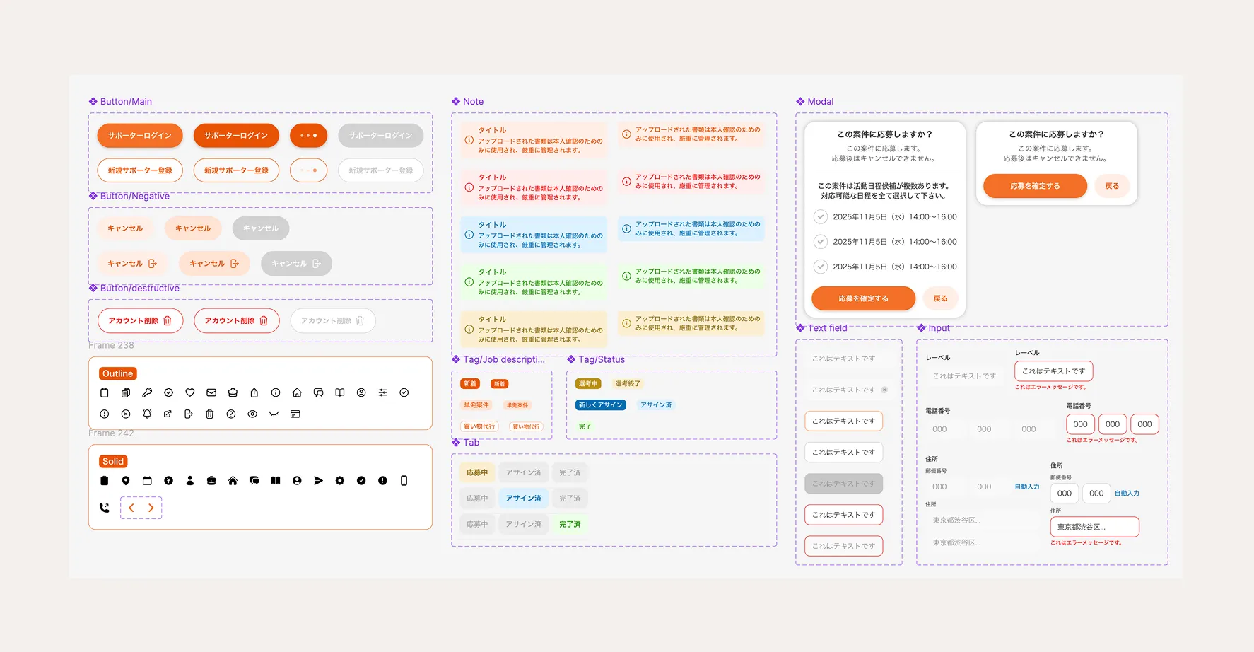
I build a scalable design system using variants and components.
Making Design Decisions
UI Design
01 Simplified Filtering Based on User Data
Since the number of active projects at any given time is limited to around 10, I determined that a complex filtering system with granular date and time pickers was unnecessary.
Data-Driven Logic: My analysis showed that 69% of supporters are middle-aged to seniors active on weekdays, while 21% are professionals active on weekends. Consequently, I streamlined the filter to only include Morning/Afternoon/Night (Weekday vs. Weekend) and Location. This "less is more" approach ensures the feature is perfectly tailored to real-world usage.
02 Chat Interface UI
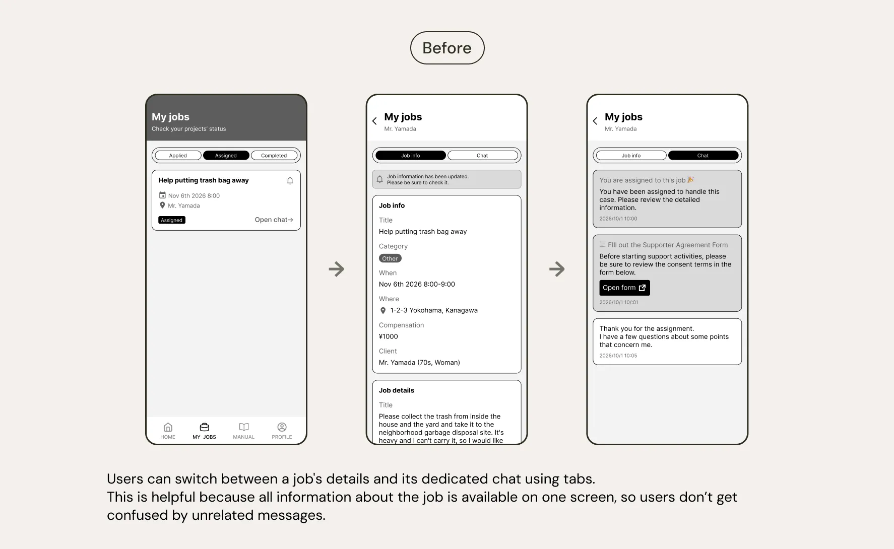
The initial design used a tab layout to switch between job details and a chat screen for each assigned job.
However, after checking with the client about actual communication patterns, we learned that conversations were not limited to specific job assignments. Supporters also had general inquiries and casual exchanges unrelated to any particular job.
In response, we redesigned the chat as a standalone feature accessible at all times, independent of individual job pages.

03 Progress Visualization UI
Consistent color coding based on progress status
Since each supporter can have multiple jobs at different stages simultaneously, applied but pending, assigned, or completed, we used distinct color schemes for each status. Applying these colors consistently throughout the app made it easy for users to understand which stage they were in at a glance.

Stepper added to the supporter registration screen
The supporter registration form required a large number of fields, which risked making the process feel overwhelming if all questions were displayed at once. To address this, the questions were grouped into categories, and a stepper was introduced so users can track their progress category by category. This allows users to see where they are in the registration process and how much is left, so they can move through onboarding with confidence.

Preparing Handoff Design File
Developers Handoff
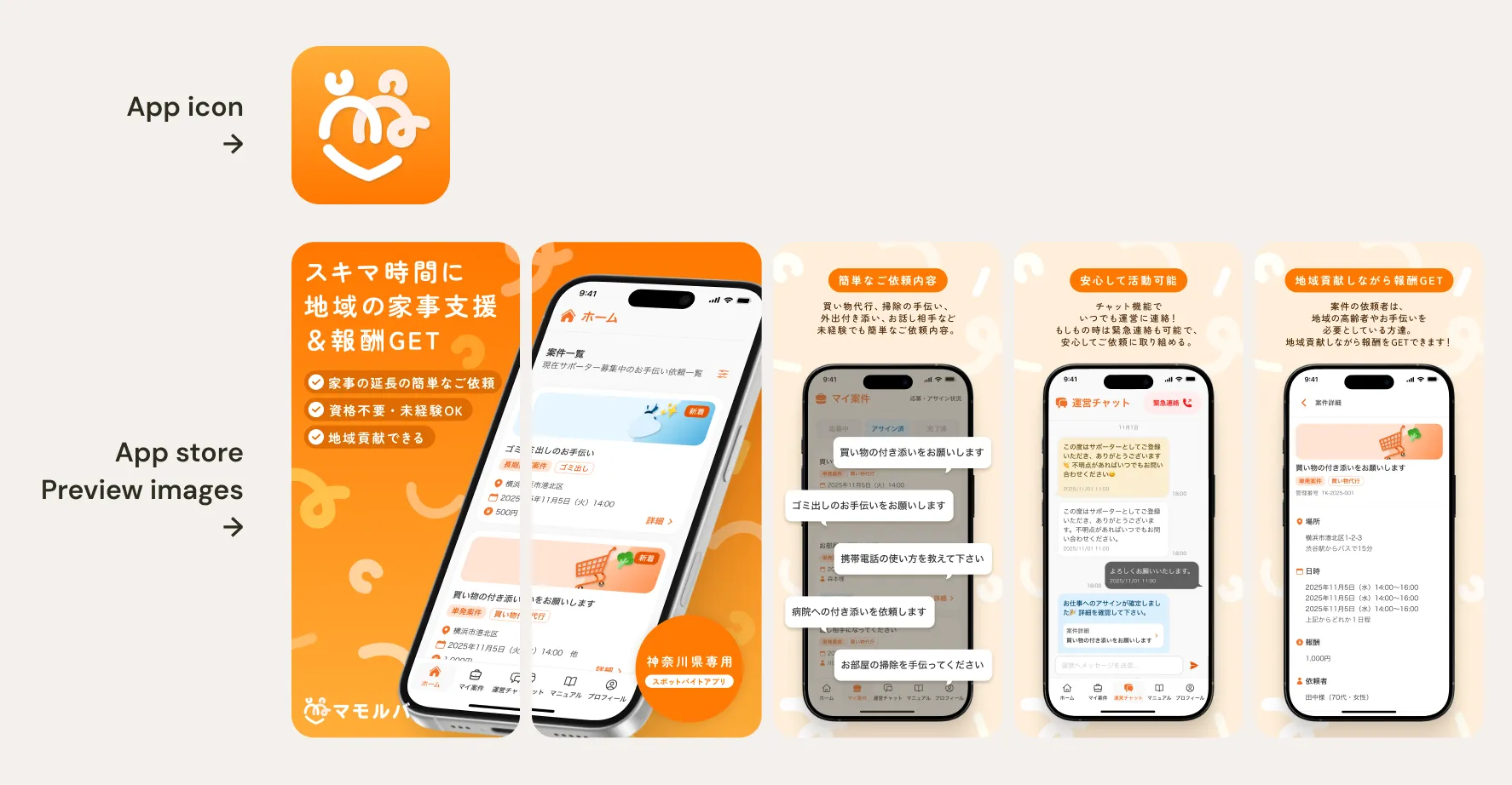
To ensure a smooth handoff to developers, a dedicated design handoff file was prepared. To minimize situations where developers would need to make judgment calls on UI/UX design decisions during implementation, all component states including error states were designed with copy and visuals, and annotations were used to leave clear instructions. App assets required for launch, including the app icon and App Store images, were also prepared for both iOS and Android.
Annotations and comments were used to communicate intent for edge cases, implementation notes, link destinations (where not obvious), toast messages, and error state copy.
Where needed, Lottie was used to convey the intended animation behavior.
By designing in accordance with the design system, the handoff file maintains consistency and is easy to implement.

Outcomes
Outcomes
Operational Efficiency & Scaling
I successfully slashed the operational hours previously required from the client. This transition from manual tasks to a centralized system has paved the way for a more scalable and efficient business model.
Achieved a 100% matching rate
In the pilot project for a "community mutual-aid lifestyle support service" conducted from January to March 2026 in Yokosuka City, as part of "YAK" — an open innovation program led by Kanagawa Prefecture — a 100% matching rate was achieved between service users and supporters. The success of this pilot experiment has led to the continuation of the service going forward, as well as plans to expand the coverage area.

