Nanji App
Product Design
Overview
Living in Vancouver, Canada while working with clients in Japan, I run into moments almost every day where the time difference matters, whether it's a quick message or scheduling a meeting.
I tried several sites and apps for checking time differences, but none of them quite felt right: some had outdated UIs, some required registering cities every time, and some just weren't intuitive.
"I just want to check the time difference, quickly." That everyday frustration of my own was the starting point for this project.
With the concept of "the simplest time difference tool, made by a designer," I owned the entire process as a solo designer, from design through implementation and release, bringing AI in as a thinking partner and execution partner at every phase.
Client
Personal project
My role
Product designer
Completed
2026.7
The Concept of nanji?, Shaped by Research
Research
Although this project started from a personal inconvenience, I first wanted to confirm whether my own problem was one other users shared too.
Market Research & Competitive Analysis
By 2026, 52% of the global workforce was working remotely, and 43% of them named time zone management as their biggest challenge. The two leading competitors, World Time Buddy (feature-rich, but the free version is full of ads and limits the number of cities) and Every Time Zone (simple, but not customizable), shared the same weaknesses: settings couldn't be saved, and the design felt outdated.

User Survey
I then surveyed 15 people who regularly deal with time zones, using a Google Form to ask whether they check time differences daily, what tools or methods they currently use, and what frustrations they have with existing options.
Key Findings
The survey revealed the following.
[Current behavior]
Over 73% check time differences 5+ days a week, mainly when deciding whether it's okay to reach out right now, or when scheduling meetings
Everyone used their smartphone's built-in clock, and on top of that combined tools like Google search, AI, and time zone apps, or did the math themselves
[Pain points]
Checking the current time wasn't a problem, but comparing future dates and times required combining multiple tools such as Google search, calendars, and AI, which was slow and tedious
Concerns like "I might miscalculate" and "checking repeatedly is a hassle" came up repeatedly
The need to compare multiple date candidates at once was also a recurring request

Two Jobs to Be Done, Defined From This Research
Based on these findings, I broke the job this product needed to do down into two.
01 — Reaching Out
When I need to decide whether it's okay to contact someone right now, I want to see at a glance whether they're within working hours, so I can reach out at a considerate time without stopping to think or spending time calculating.
02 — Scheduling
When setting up a meeting with someone in a different time zone, I want to convert several candidate times without hassle, so I feel less anxious about miscalculating and less likely to send the wrong meeting time.
Job 1 held up largely unchanged through the rest of the project. The real design challenge was Job 2, and this is where my first hypothesis went wrong.
The Concept This Led To
Based on the research findings and JTBD 1 and 2, and with an emphasis on making it easier to handle future dates and times, I moved forward with the design under the concept of;
"the simplest, most intuitive, and refined tool for instantly checking the time difference."
Building the Hypothesis
Ideate
Defining Personas
To make concrete who Job 1 and Job 2 actually happen to, and in what situations, I defined three personas. For each, I also mapped out, in chronological order, when during the day they'd use this app. Translating the abstract motivation behind the JTBDs into specific usage scenes brought the shape of the feature requirements into focus.


Forming a Feature Hypothesis
I interpreted the survey finding that "I want to compare and calculate multiple date candidates at once" (11 of 15 respondents) as a concrete feature requirement for Job 2, as follows.
Hypothesis
"Reaching the converted time information by the shortest path is the most important value."
Based on this premise, I designed the following features.
Features:
A feature-rich "time search" with three modes: single date/time, relative time, and batch conversion of multiple date candidates
A timeline with cities on the horizontal axis and time on the vertical axis, color-coded by time of day
A Business Hours mode that visually indicates working hours, in addition to the normal mode

Turning Ideas Into Something Real, and Testing the Experience
Implementation
Rapid Prototyping
First, I worked with AI as a thinking partner to quickly and thoroughly organize the functional requirements, then created a requirements document and mapped out the user flow and screen structure. Rather than judging based on static screen designs alone, I built an HTML rapid prototype to validate it as a real, hands-on experience.
By actually operating the prototype, I validated the following.
Can users visually compare time differences across multiple cities?
Can users intuitively jump to a target time?
Does each feature fit naturally into the user's everyday workflow?
I ran through the prototype following each persona's usage scenarios, and by fixing unnecessary features and confusing flows, locked in the direction of the experience before implementation. This phase served to finalize the spec and screen design to the point where handing only the requirements document to AI afterward would result in a complete implementation.

Implementation
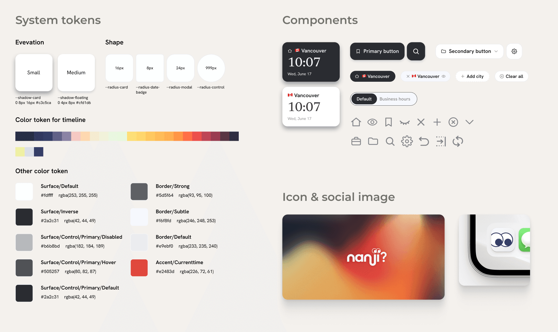
In the implementation phase, I moved product development forward using an AI-powered code editor (Cursor). To realize nanji?'s concept of "simple, refined design," I first used the HTML prototype as a base and detailed the visual design of the main screen in Figma. I organized the rules for color, typography, spacing, and components, and built a design system so a consistent UI could be applied across the whole product.
I documented the completed design system in Markdown and shared it with Cursor as implementation specifications, making it possible to generate and implement consistent designs for additional screens and new components based on the defined UI rules. By sharing design intent and decision criteria with AI, I streamlined the process from design to implementation while maintaining quality across the whole product.

The Hidden Cost of "Converting," Revealed by Real User Interviews
User Testing
I ran user testing to confirm that the finished product could actually solve users' time zone scheduling tasks. When users carried out a real meeting-scheduling task, their behavior differed from what I had expected.
Test Scenario
I asked users to complete the following task, reproducing a situation that could realistically come up at work;
"Please set up a meeting with a client based in London.
From the London-time candidates "Monday 9:00–12:00" or "Wednesday 12:00–19:00," choose a time that works for you (Vancouver time), and write the candidate date and time to propose to the other person in London time."
Observation
Users picked times on the timeline rather than using "multiple search."
had expected this task to make use of the batch multi-time search feature. But in testing, most users didn't use it at all, and instead checked the time difference between cities directly on the timeline and picked candidate times right there.
The cause lay in the steps users actually went through to complete the task.
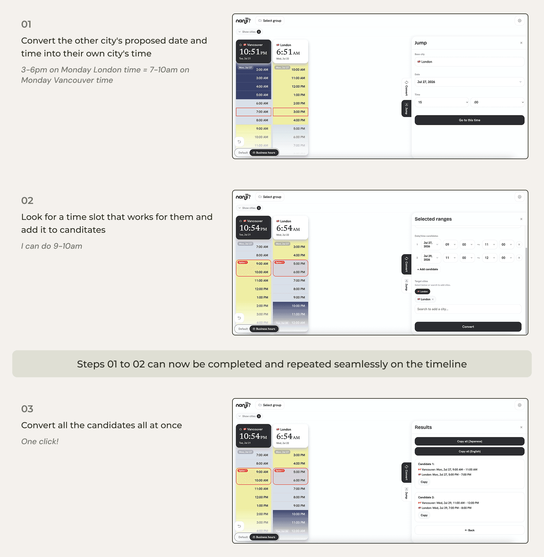
Convert the other city's proposed date and time into their own city's time
Look for a time slot that works for them
Convert the candidate time back into the other city's time
Repeat steps 1–3 for each candidate if there're several candidates
In other words, users spent most of their time and effort on the steps before ever reaching the multi-search feature.
Users said things like:
"It feels safer to find candidates by visually checking the time difference on the timeline."
"Entering everything into the multi-search field at once is a hassle, and I might mistype something."

Insight
This result made me realize my original hypothesis had been wrong. I had assumed the user already has a fixed date and time in mind and wants to convert it.
But in actual user behavior, the central process was exploratory: going back and forth between the other person's time and their own city's time, comparing the difference, and deciding on a candidate on the spot.
From a Search-Centered Design to a Timeline-Centered Experience
User Testing
The insight from user testing showed that my definition of, and hypothesis about, Job 2 had been wrong. The process of narrowing down candidate times itself, the part I had designed out of scope, carried the highest cognitive load.
I rewrote Job 2 in response.
JTBD 2, Revised:
When setting up a meeting with someone in a different time zone, I want to minimize the friction in the candidate-narrowing process itself, including the mental conversion and manual entry involved, so I don't have to spend the mental effort, and can feel at ease.
The difference from the original hypothesis is that the subject of the job broadened from "converting" to "the entire process of narrowing down a candidate" (of which converting is only one part).
Design Iteration
Based on this new JTBD 2, I reconsidered the product's core experience.
Before
A tool for searching and converting any date and time
Designed around multiple search / time conversion / candidate date input
After
A tool for intuitively choosing a time on the timeline
Always being able to visually check the time difference is the timeline's strength, and focusing the experience on the timeline removes the user's cognitive and memory load.
Specifically, I made the following changes.
Removed the three search modes
Made the timeline persistently visible
Narrowed the feature set to two: "Jump," which moves to any point in time on the timeline, and "Convert," which lets users check business hours and select multiple candidates on the timeline to convert them all at once
Validated by strangers! A real fit for a real pain point
Outcome
The LinkedIn launch post gained 50K impressions, around 300 likes, and about 25 positive comments!
Feedback consistently highlighted that the app felt more intuitive than existing timezone tools, solved a frequent pain point for people working across countries, and made useful features like Business Hours immediately understandable.
This response validated that the design principles identified during the Test & Learn phase, “no calculation” and “no memorization,” resonated not only with people I knew, but also with first-time users encountering the product organically.
What I'd Change Next Time
Takeaway
Do job discovery through qualitative, behavior-based research, keeping the functional and emotional dimensions separate
Relying on a survey (quantitative, a "what do you want" format) for the initial discovery let me capture the functional desire ("I want to compare multiple date candidates"), but not the emotional job ("I want to feel reassured while deciding"). JTBD 2 itself was written as "I want to convert, so my anxiety goes down," subordinating the emotional dimension to the functional one as a side effect, so when I built a hypothesis, only the functional side carried through on its own.
Next time, I'd start discovery with qualitative interviews that walk through a recent, real instance of the task, and write the functional job and the emotional job as separate statements from the start. Surveys would come later, as a validation tool to confirm the scale of a job I'd already nailed down qualitatively.
Don't invest in unvalidated assumptions. Test the riskiest assumption first, as cheaply as possible
The assumption that "users can identify candidates time on their own" was never tested before I designed, built a design system for, and implemented all three search modes.
Next time, I'd explicitly label what's a verified fact versus an untested assumption within the JTBD and hypothesis, and test the riskiest assumption first with the cheapest possible low-fidelity prototype before moving on to polish.

