Bluearch Corporation
Web UIUX
/
Low-code Dev
Overview
BlueArch is a Japanese startup developing autonomous underwater vehicles (AUVs). I had previously designed their corporate website when they were established as a non-profit association. This time, I was brought back to redesign the site in line with their transition to a corporation. As the business scope and scale had expanded significantly, the new site needed to reflect that growth, speak to a new target audience, and establish a refreshed brand identity.
As the UX/UI designer, I handled the project end-to-end — from project management and design to low-code implementation and pre-launch handoff — completing the work in just four weeks while collaborating with a director who had deep expertise in the client's business domain.
Client
BlueArch corporation
My role
Web UIUX designer
Completed
2025.5
Team
In collaboration with a project manager

A Site Design Worthy of a Business Launch
Concept
I worked with the client to identify what had changed with the transition from non-profit to corporation, and translated those changes into a concept for the new site.
We agreed that the site should create an immersive, high-impact experience that communicates the scale and ambition of the business.

Translating the Concept into Structure
Wireframing
To bring the immersive design vision to life, I used wide layouts with generous whitespace throughout.
For the company history section, rather than simply listing the transition from non-profit to corporation, I proposed an information architecture that highlighted BlueArch's distinct strengths: field expertise built through hands-on work, and world-class research developed in collaboration with the University of Tokyo. This framing made the section more compelling and meaningful to the target audience.

UX-Driven Decisions at Every Step
Design decisions
Every design decision was grounded in user behavior and visual logic. By clearly articulating the reasoning behind each choice, discussions with stakeholders moved beyond gut feeling and toward evidence-based decisions.
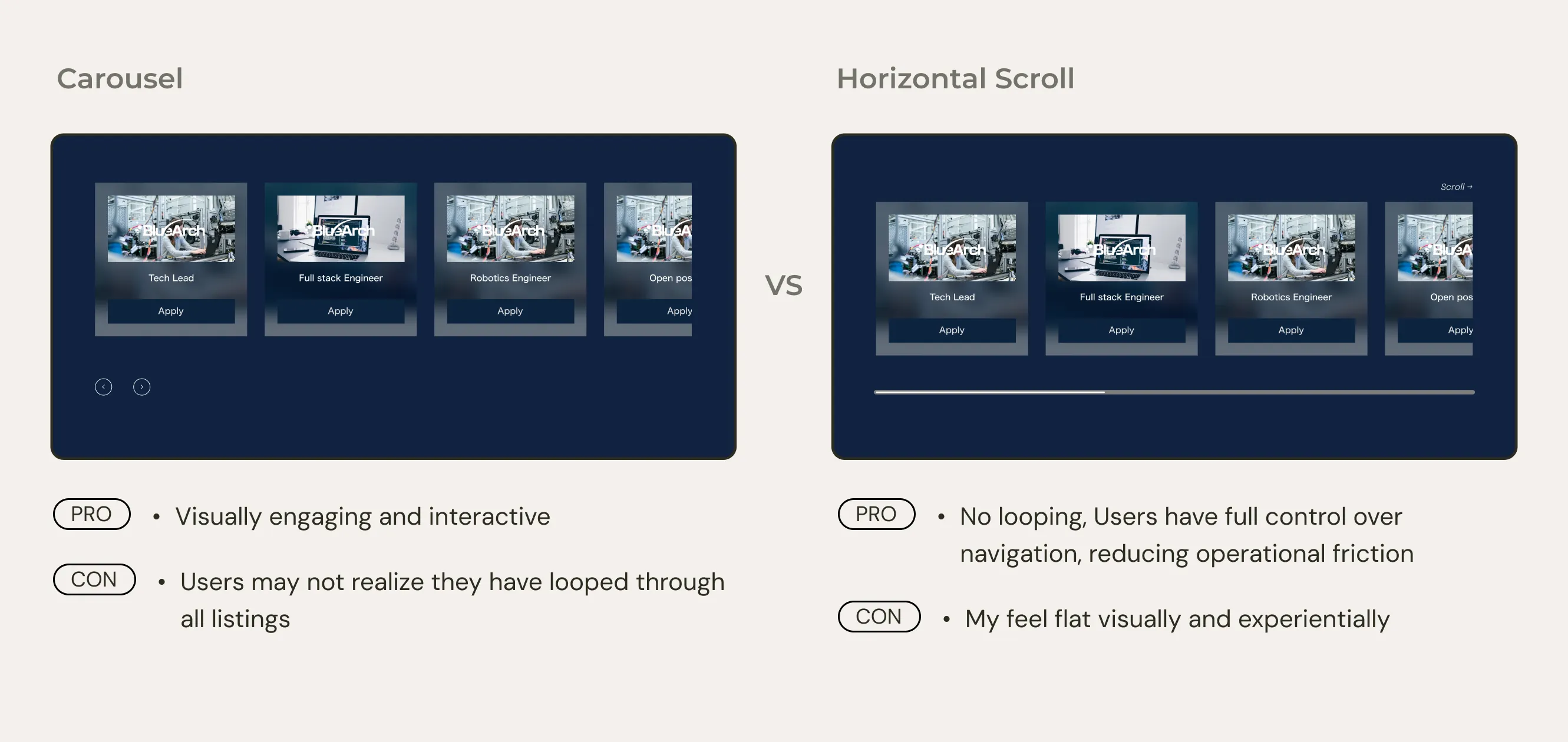
01 Carousel vs. Horizontal Scroll
The client wanted to display open job listings using a carousel. During kickoff, I learned there were currently 4 to 5 open positions with plans to grow to around 10.
With this context, I built prototypes of both options and shared them with stakeholders, along with a structured breakdown of the tradeoffs.
Permanent Carousel
Pros /
Visually engaging and interactive, creating a strong first impression
Infinite looping makes the number of listings feel larger
Cons /
Without indicators or a progress bar, users cannot tell how many listings exist in total. If similar positions appear in sequence, users may not realize they have looped through all listings and end up reviewing the same ones repeatedly
The only navigation options are auto-scroll or advancing one card at a time. As positions increase, job seekers would need to click through each listing individually to find what they are looking for, which adds friction at a critical point in the application decision process and could negatively affect conversion
Horizontal Scroll
Pros /
No looping, so users can see all listings at once and navigate at their own pace
Users have full control over navigation, reducing operational friction
Cons /
If the number of listings is small or the viewport is wide, scrolling may not be required, resulting in a simple row of cards that feels flat visually and experientially
The carousel was ultimately chosen to prioritize a richer visual experience. To address the UX concerns I raised, we landed on a compromise: a CTA reading "View all open positions" was added directly below the carousel.
02 From One Photo to Two
For the history section showcasing the transition of the. company from a NPO to a corporation, the wireframes originally placed a single photo in each section. For the research facility section, the client provided one photo of a water tank. Viewed in isolation, however, it resembled a black reflective surface more than a tank, making it unclear what it was or where it was located.
While the text referenced the water tank, users tend to look at images before reading copy on a webpage. I felt the single photo lacked enough context on its own, so I proposed adding a second photo showing the interior of the research facility more clearly, creating a two-photo composition.
With both images together, users naturally understand that one shows a water tank inside a research facility, allowing each photo to communicate its intended meaning effectively.

03 Multiple Design Options for High-Impact Sections
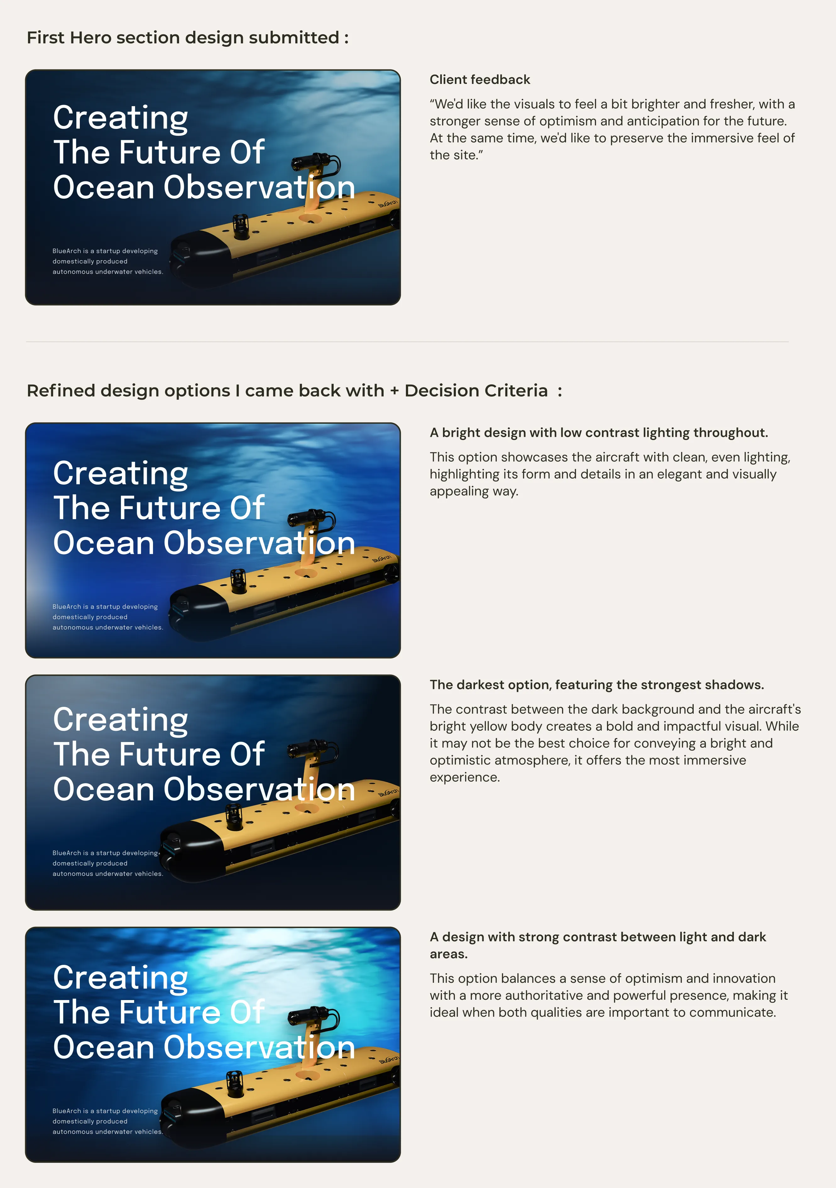
The first view and the vision section are critical touchpoints that shape the user's initial impression and carry the client's core message. For these, I prepared multiple design variations with carefully adjusted layouts, visuals, and brightness levels.
When presenting the options for a final decision, I provided a clear decision framework rather than asking for a gut response. For example: "If communicating optimism about the future is the priority, Option A is the stronger choice. If you want to emphasize immersion and authority, Option B is better." This helped the client make confident, well-reasoned decisions rather than choosing based on personal taste alone.
Final Design
UI Design

Site Management Manual
Support
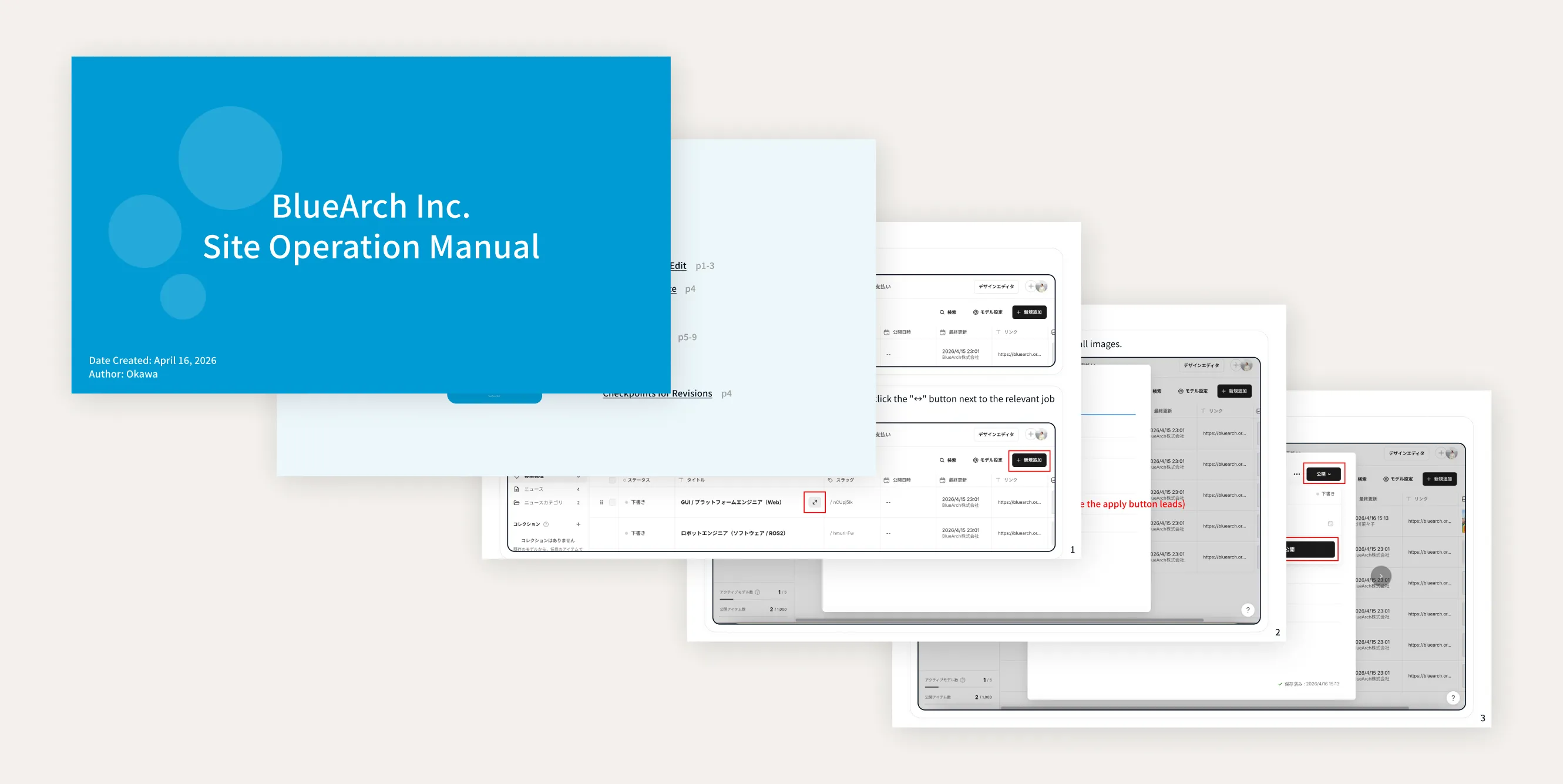
To make the site easy for the client to maintain independently, the build made extensive use of CMS models. I also prepared an operations manual to support the client in managing the site on their own. With this in place, the client can now update articles and job listings without outside help.
Outcomes
Outcomes
Site launched on schedule for the press announcement
The client needed the site live within four weeks ahead of a press event. We delivered on time, with the site ready for the announcement.
Drove a 3.1% inquiry conversion rate in its first 2.5 months live.
The completed site matched the expanded scope and positioning of the business, driving high rate of inquiry conversion rate. The client expressed strong satisfaction with the outcome.

