マモルバアプリ
Product Design
概要
本プロジェクトのクライアントである株式会社OTERAは、地域住民の掃除や買い物などの「小さな困りごと」と「地域住民をサポートしたい人」とを有償ボランティア形式でマッチングする地域サポートサービス「マモルバ」を運営している。このサービスをよりスムーズに運営するにあたり、当初クライアントが手作業で行っていたマッチング業務を効率化するため、お仕事マッチングアプリの開発を検討していた。
私はUXUIデザイナーとして開発者2名と協力し、マッチング業務プロセスの分解からアプリ要件への落とし込み、ワイヤーフレーミングとUIデザインまでを担当した。
本プロダクトデザインのプロセスではAIツールを積極的に活用し、2ヶ月というスピーディーなリリースを実現した。
クライアント
株式会社OTERA
役割
プロダクトデザイナー
完了
2026.7
現状の課題の確認
目的
クライアントは、サポーター登録者をスプレッドシートで更新管理し、登録内容を手動で確認した上で別のLINEにてお手伝い案件を案内し、案件アサイン後はLINE内にて手動メッセージで詳細情報の提供などを行っており、膨大な時間をマッチング作業に費やしている点が課題だった。
今回のアプリ開発の主な目的は、運営が手動で行っているマッチング作業やマッチング後のコミュニケーションといった作業をアプリで自動化し、手作業による稼働を減らして、よりスムーズな運用を実現することだった。
私はプロダクトデザイナーとして、アプリ通して、サポーターも運営もスムーズに案件に取り組める環境づくりを行い、サポーターの登録から案件への応募、アサインされてから活動完了までに必要な情報やものがアプリ上で一通り確認できる状態を実現することを目指した。そのためにまず、現状のサービス提供までのフローを整理し、どこからどこまでをアプリの機能として落とし込むべきかを確認した。
アプリのコンセプトは「考えなくていい、お手軽地域貢献」
お仕事マッチングアプリの特性上、ユーザーは、案件への応募前・応募後アサイン前・アサイン済み・完了済み案件など、案件ごとに異なる進行状況を把握し、案件の進行状況ごとに必要な対応を同時に行う必要がある。
また、このアプリのユーザーのメインセグメントは40~60代の地域貢献しながらお小遣いを稼ぎたい層を想定している。ユーザーが、難しく考えずに直感的に案件応募から活動完了までのフローをスムーズに体験できる設計を行いたかった。
そこで、アプリのコンセプトは「考えなくていい、お手軽地域貢献」とした。これにより、案件がどの進行状態なのか、次にやることが何なのか、ユーザーが自分で考えなくても必要なタイミングで必要な情報に辿り着けるアプリを実現したいと考えた。

User Survey
I then surveyed 15 people who regularly deal with time zones, using a Google Form to ask whether they check time differences daily, what tools or methods they currently use, and what frustrations they have with existing options.
Key Findings
The survey revealed the following.
[Current behavior]
Over 73% check time differences 5+ days a week, mainly when deciding whether it's okay to reach out right now, or when scheduling meetings
Everyone used their smartphone's built-in clock, and on top of that combined tools like Google search, AI, and time zone apps, or did the math themselves
[Pain points]
Checking the current time wasn't a problem, but comparing future dates and times required combining multiple tools such as Google search, calendars, and AI, which was slow and tedious
Concerns like "I might miscalculate" and "checking repeatedly is a hassle" came up repeatedly
The need to compare multiple date candidates at once was also a recurring request

Two Jobs to Be Done, Defined From This Research
Based on these findings, I broke the job this product needed to do down into two.
01 — Reaching Out
When I need to decide whether it's okay to contact someone right now, I want to see at a glance whether they're within working hours, so I can reach out at a considerate time without stopping to think or spending time calculating.
02 — Scheduling
When setting up a meeting with someone in a different time zone, I want to convert several candidate times without hassle, so I feel less anxious about miscalculating and less likely to send the wrong meeting time.
Job 1 held up largely unchanged through the rest of the project. The real design challenge was Job 2, and this is where my first hypothesis went wrong.
The Concept This Led To
Based on the research findings and JTBD 1 and 2, and with an emphasis on making it easier to handle future dates and times, I moved forward with the design under the concept of;
"the simplest, most intuitive, and refined tool for instantly checking the time difference."
コンセプトを設計する
コンセプト
アプリのコンセプトは「考えなくていい、お手軽地域貢献」
お仕事マッチングアプリの特性上、ユーザーは、案件への応募前・応募後アサイン前・アサイン済み・完了済み案件など、案件ごとに異なる進行状況を把握し、案件の進行状況ごとに必要な対応を同時に行う必要がある。
また、このアプリのユーザーのメインセグメントは40~60代の地域貢献しながらお小遣いを稼ぎたい層を想定している。ユーザーが、難しく考えずに直感的に案件応募から活動完了までのフローをスムーズに体験できる設計を行いたかった。
そこで、アプリのコンセプトは「考えなくていい、お手軽地域貢献」とした。これにより、案件がどの進行状態なのか、次にやることが何なのか、ユーザーが自分で考えなくても必要なタイミングで必要な情報に辿り着けるアプリを実現したいと考えた。


Forming a Feature Hypothesis
I interpreted the survey finding that "I want to compare and calculate multiple date candidates at once" (11 of 15 respondents) as a concrete feature requirement for Job 2, as follows.
Hypothesis
"Reaching the converted time information by the shortest path is the most important value."
Based on this premise, I designed the following features.
Features:
A feature-rich "time search" with three modes: single date/time, relative time, and batch conversion of multiple date candidates
A timeline with cities on the horizontal axis and time on the vertical axis, color-coded by time of day
A Business Hours mode that visually indicates working hours, in addition to the normal mode

ユーザーを理解する
ユーザー分析とペルソナ
アプリのコンセプトは「考えなくていい、お手軽地域貢献」
お仕事マッチングアプリの特性上、ユーザーは、案件への応募前・応募後アサイン前・アサイン済み・完了済み案件など、案件ごとに異なる進行状況を把握し、案件の進行状況ごとに必要な対応を同時に行う必要がある。
また、このアプリのユーザーのメインセグメントは40~60代の地域貢献しながらお小遣いを稼ぎたい層を想定している。ユーザーが、難しく考えずに直感的に案件応募から活動完了までのフローをスムーズに体験できる設計を行いたかった。
そこで、アプリのコンセプトは「考えなくていい、お手軽地域貢献」とした。
これにより、案件がどの進行状態なのか、次にやることが何なのか、ユーザーが自分で考えなくても必要なタイミングで必要な情報に辿り着けるアプリを実現したいと考えた。

Implementation
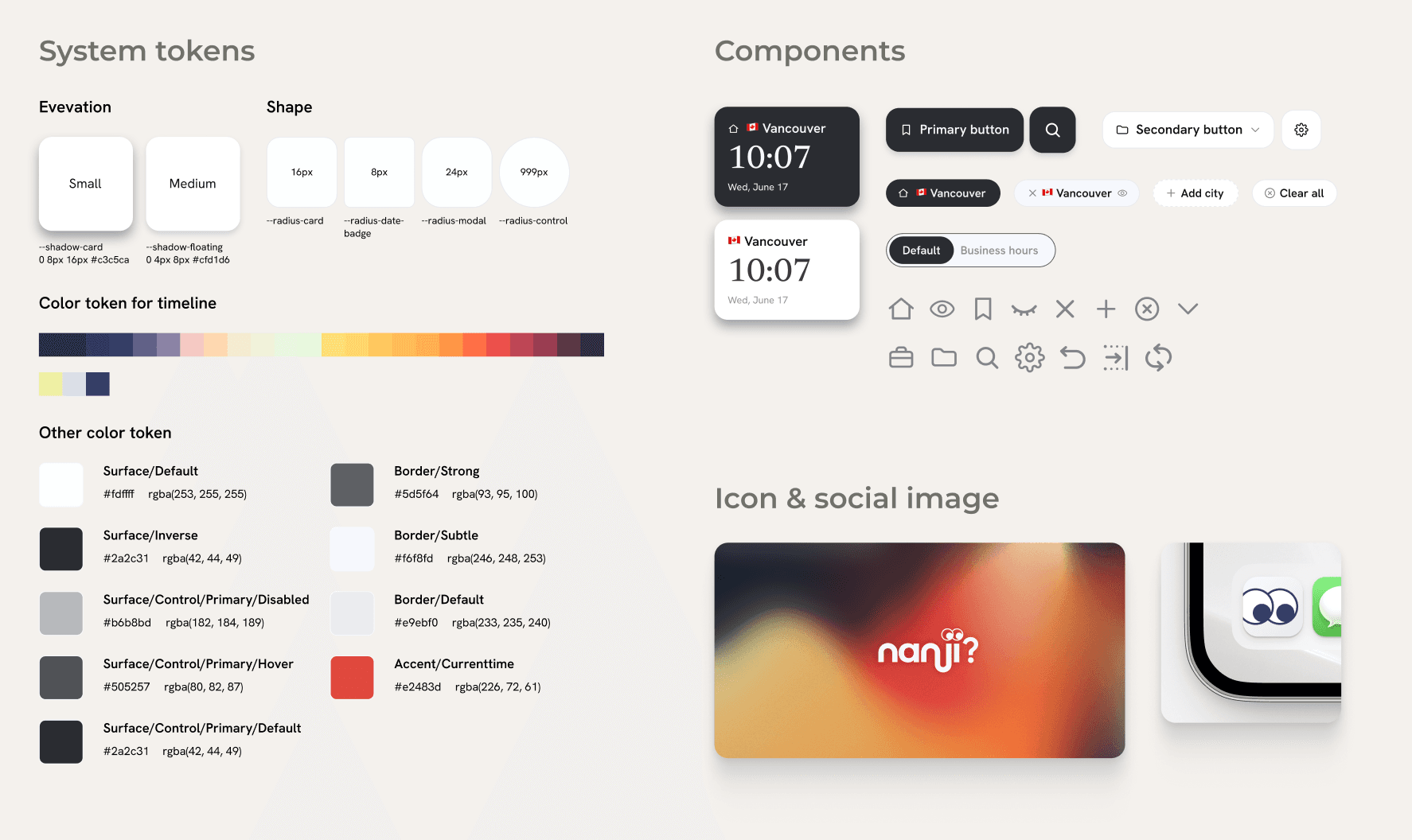
In the implementation phase, I moved product development forward using an AI-powered code editor (Cursor). To realize nanji?'s concept of "simple, refined design," I first used the HTML prototype as a base and detailed the visual design of the main screen in Figma. I organized the rules for color, typography, spacing, and components, and built a design system so a consistent UI could be applied across the whole product.
I documented the completed design system in Markdown and shared it with Cursor as implementation specifications, making it possible to generate and implement consistent designs for additional screens and new components based on the defined UI rules. By sharing design intent and decision criteria with AI, I streamlined the process from design to implementation while maintaining quality across the whole product.

スケーラブルなデザインシステムを作成
デザインシステム
UIデザインの開始するにあたり、まずはバリアンツやコンポーネントを利用して、スケーラブルなデザインシステムを作成した。
アプリのコンセプトは「考えなくていい、お手軽地域貢献」
お仕事マッチングアプリの特性上、ユーザーは、案件への応募前・応募後アサイン前・アサイン済み・完了済み案件など、案件ごとに異なる進行状況を把握し、案件の進行状況ごとに必要な対応を同時に行う必要がある。
また、このアプリのユーザーのメインセグメントは40~60代の地域貢献しながらお小遣いを稼ぎたい層を想定している。ユーザーが、難しく考えずに直感的に案件応募から活動完了までのフローをスムーズに体験できる設計を行いたかった。
そこで、アプリのコンセプトは「考えなくていい、お手軽地域貢献」とした。
これにより、案件がどの進行状態なのか、次にやることが何なのか、ユーザーが自分で考えなくても必要なタイミングで必要な情報に辿り着けるアプリを実現したいと考えた。
Observation
Users picked times on the timeline rather than using "multiple search."
had expected this task to make use of the batch multi-time search feature. But in testing, most users didn't use it at all, and instead checked the time difference between cities directly on the timeline and picked candidate times right there.
The cause lay in the steps users actually went through to complete the task.
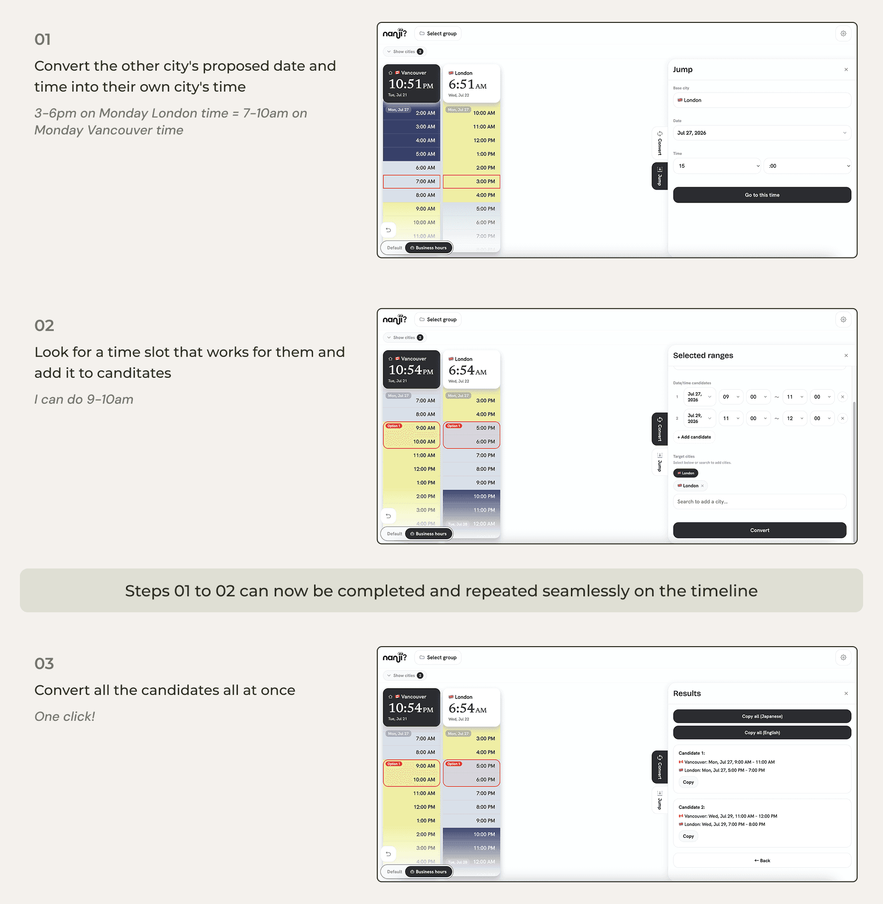
Convert the other city's proposed date and time into their own city's time
Look for a time slot that works for them
Convert the candidate time back into the other city's time
Repeat steps 1–3 for each candidate if there're several candidates
In other words, users spent most of their time and effort on the steps before ever reaching the multi-search feature.
Users said things like:
"It feels safer to find candidates by visually checking the time difference on the timeline."
"Entering everything into the multi-search field at once is a hassle, and I might mistype something."

Insight
This result made me realize my original hypothesis had been wrong. I had assumed the user already has a fixed date and time in mind and wants to convert it.
But in actual user behavior, the central process was exploratory: going back and forth between the other person's time and their own city's time, comparing the difference, and deciding on a candidate on the spot.
From a Search-Centered Design to a Timeline-Centered Experience
User Testing
The insight from user testing showed that my definition of, and hypothesis about, Job 2 had been wrong. The process of narrowing down candidate times itself, the part I had designed out of scope, carried the highest cognitive load.
I rewrote Job 2 in response.
JTBD 2, Revised:
When setting up a meeting with someone in a different time zone, I want to minimize the friction in the candidate-narrowing process itself, including the mental conversion and manual entry involved, so I don't have to spend the mental effort, and can feel at ease.
The difference from the original hypothesis is that the subject of the job broadened from "converting" to "the entire process of narrowing down a candidate" (of which converting is only one part).
Design Iteration
Based on this new JTBD 2, I reconsidered the product's core experience.
Before
A tool for searching and converting any date and time
Designed around multiple search / time conversion / candidate date input
After
A tool for intuitively choosing a time on the timeline
Always being able to visually check the time difference is the timeline's strength, and focusing the experience on the timeline removes the user's cognitive and memory load.
Specifically, I made the following changes.
Removed the three search modes
Made the timeline persistently visible
Narrowed the feature set to two: "Jump," which moves to any point in time on the timeline, and "Convert," which lets users check business hours and select multiple candidates on the timeline to convert them all at once
デザインにおける判断
UIデザイン
アプリに一度に掲載される案件数は多くても10件程度であるため、日付や時間を指定するような精緻なフィルタリング機能は不要だと判断した。
ユーザー分析の結果、サポーターは平日に活動する中年〜初老層が69%、休日に活動する社会人層が21%に分類される。そこで、フィルタリング要素は平日・休日それぞれの午前/午後と地域選択のみに絞り、実用性に即した機能とした。
What I'd Change Next Time
Takeaway
サービス運営の効率化
アプリ開発の大きな目的であった、サポーター登録管理や案件アサインなどクライアントの手作業による業務時間の大幅な削減によるサービス運営の効率化を実現した。
実証事業においてマッチング率100%を達成
神奈川県が主導するオープンイノベーションプログラム「YAK」において、2026年1月から3月まで実施していた横須賀市をフィールドとした「地域共助型生活支援サービス」の実証事業において、サービス利用者とサポーターのマッチング率100%を達成。実証実験の成功と、今後のサービス継続・さらに対象エリア拡大へつながった。

